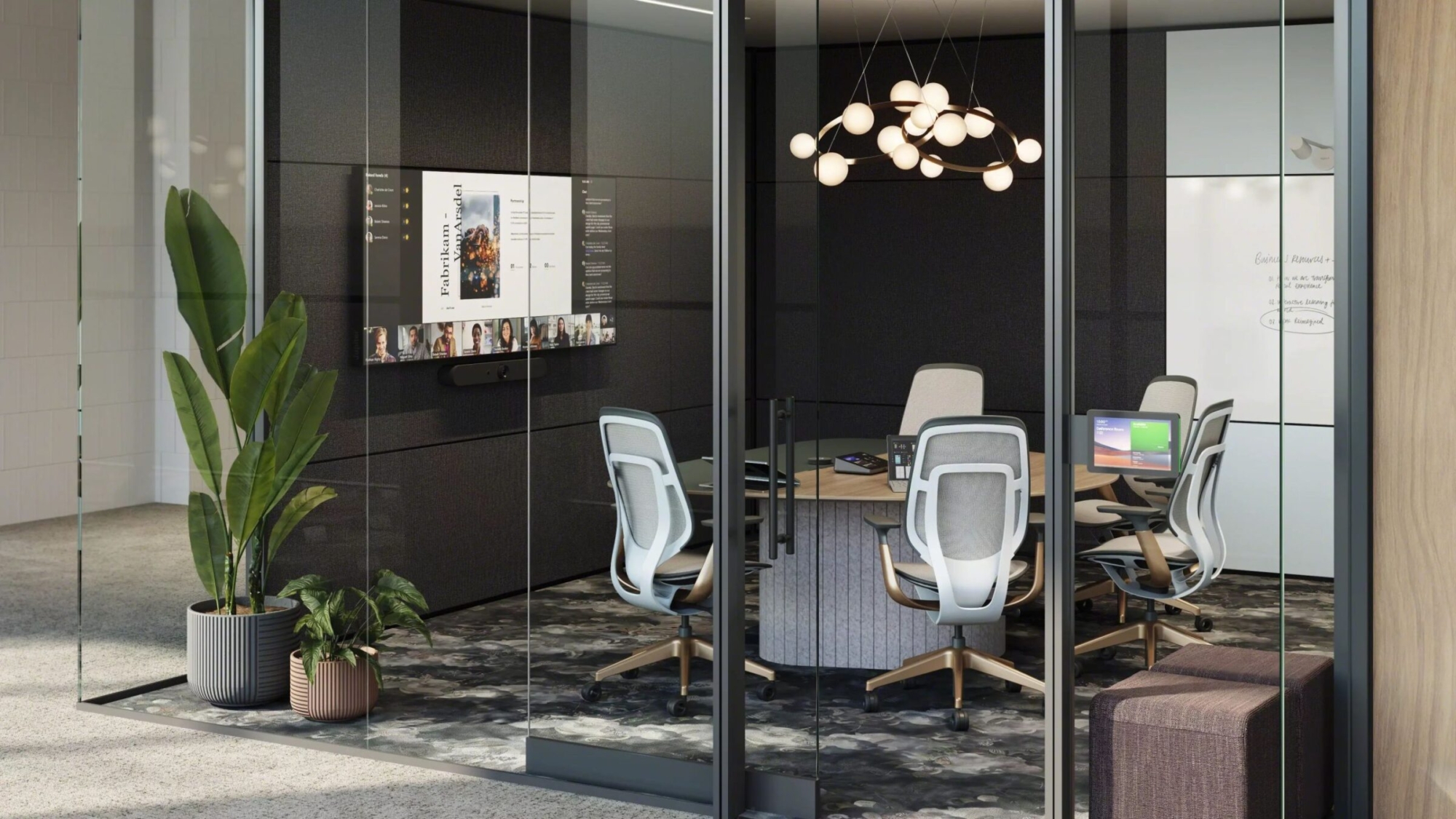
Half of all meetings these days are spent on video. Employees want to work and hold meetings in spaces where they look better, sound better, and can hear better. Here are four design principles Steelcase has learned in their research to keep in mind when developing collaboration spaces employees love to use:
- Consider room layout so everyone faces the camera. This may mean shifting orientation to the long wall instead of the short wall in a room.
- In enclosed spaces, center the camera in the room to ensure everyone at the table is in the field of view.
- Limit the spread of sound and atmospheric noise and echoes. Consider fabric wall treatments, carpet, panels, and softer seating. Acoustic fabric panels opposite the technology in the room will help with sound
absorption. - Provide multi-faceted lighting of the space, people, and background. Avoid lights that are directly behind the individuals on camera.
One more tip. If you make your technology easier to use, the more likely your team will be to use it. Get as close to one touch technology as possible.
See you in the office!
Scott Galloway
Receive our Newsletter
To receive our newsletter, including new editions of spaces and other digital content, fill out the form:


